

Simple doesn’t mean cheap.
A minimal wedding backdrop costs less to execute but requires more intentionality to look expensive.
The difference between a backdrop that reads as budget-constrained and one that reads as intentionally designed is strategy—choosing one element and styling it with restraint, using negative space as design, and understanding that expensive-looking weddings leave room to breathe.
You can elevate simple materials ($100–$300 budget) to photograph like luxury ($2,000+ installations) by understanding proportion, restraint, and the power of what you don’t add.
Less occupies more space because there’s room to see it.
A single branch holds more than a thousand flowers pressed too close, fighting for attention.
Simplicity asks the eye to stay.
The Short Answer
Choose one element (a single geometric arch, vertical greenery installation, or architectural feature) and style it meticulously with perfect spacing, balanced proportions, and premium materials.
Skip everything else.
White paint, clear stands, natural light—these are free. Intentionality—the decision to use less—costs nothing but reads as expensive design.
If you’re doing simple, commit fully.
No apologies, no filler, no “we would have added more but didn’t have budget.”
Design as if simplicity was your first choice, because once you commit, it is.
1. One Element Done Perfectly (Beats Ten Elements Done Okay)

Professional designers achieve expensive-looking simplicity by choosing one focal point and styling it meticulously.
An arch. A suspended installation. A statement wall. Then stopping.
Single metal arch, unadorned ($400–$800): Thin frame, clean lines, zero flowers.
Position with intention.
Perfect spacing between the couple and the structure.
No decoration. This reads as intentional luxury because the architect
ure is confident enough to stand alone.
One vertical installation ($300–$700): Tall greenery, one statement flower, or a single sculptural element positioned as focal point.
Everything else empty. Professional because the design chose restraint.
Architectural use ($0 cost): Columns, windows, walls. Position the couple thoughtfully.
Let the venue’s bones be the design. Confidence through authenticity beats decoration.
Pro principle: Expensive-looking minimalism requires perfect execution of one idea, not mediocre execution of many ideas.
Price range: $0–$800. Cost is irrelevant; execution is everything.
2. Vertical Design (Use Height, Not Width)
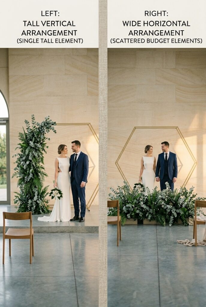
Simple backdrops that photograph well use vertical space strategically—tall narrow installations rather than wide sprawling ones.
This creates visual drama with minimal material.
Tall greenery wall (6–10 feet tall, 4–6 feet wide, $200–$400): Narrow vertical column of eucalyptus, moss, or preserved greenery.
Vertical proportion reads expensive and modern.
Uses less material than a wide backdrop of same visual impact.
Budget-friendly execution that photographs like luxury.
Suspended single element (hanging branch, sculpture, or installation, $200–$500): Literally hanging from above changes the perception of the space.
Eliminates ground-level clutter.
Professional because it defies the expected (backdrops usually stand on ground).
Photograph with couple below, element above—creates visual intrigue.
Tall single flower or branch ($50–$150): One oversized branch or preserved flowers positioned 8–10 feet tall. Statement without bulk.
Minimal cost, maximum visual impact because of scale and isolation.
The principle: vertical space costs less to fill than horizontal space, and tall narrow designs photograph more elegantly than wide sprawling ones.
Price range: $50–$500. Vertical strategy saves money while photographing expensively.
3. Material Elevation: Make Cheap Look Premium
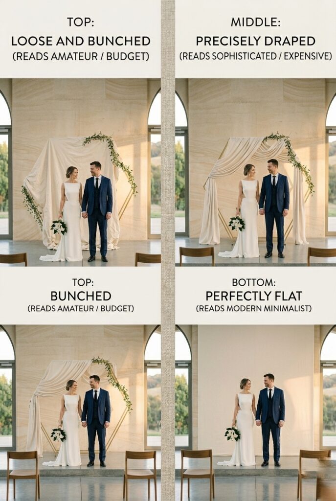
Simple backdrops use basic materials elevated through presentation. The difference between $50 and $500 backdrops isn’t always material cost—it’s how deliberately they’re styled.
Canvas or muslin ($20–$60): Paint solid color or leave natural. Drape with intention—every fold deliberate, spacing exact.
Professional painters spend hours on fabric positioning because precision reads as expensive.
DIY: buy canvas, drape it yourself, style meticulously.
Cost: $50. Result: looks like $800 if positioning is perfect.
Preserved greenery ($100–$300): Doesn’t wilt, lasts indefinitely, photographs cleanly.
Buy from craft stores (cheap) or specialty vendors (premium). Same material, different presentation cost.
Place deliberately, with perfect spacing.
Professional because greenery alone reads as botanic and intentional.
Wooden elements ($0–$200): Reclaimed wood, branches, or a simple wooden structure.
Weathered wood reads expensive when positioned with restraint. Paint it white or leave natural.
Minimal styling, maximum impact because wood has inherent character.
The principle: How you present simple material determines whether it reads as expensive.
Perfect spacing, intentional positioning, and refusing to add “just a little more” creates the perception of luxury.
Price range: Materials $20–$100.
Presentation (your time and intention) costs nothing but determines the perceived value.
Budget Hack: Buy $25 canvas drop cloth from Home Depot. Paint it white ($5 in paint).
Drape on simple stand ($40 from Amazon). Total: $70.
Photographs identically to $800 premium backdrops if proportions and spacing are perfect. The secret: precision, not price.
4. Negative Space as Design Element

The most expensive-looking simple backdrops use empty space deliberately. What you don’t fill matters as much as what you do.
The principle: Frame your couple with space around them. Space is design.
Empty walls, empty sky, empty floor area—these aren’t “blank,” they’re intentional framing that keeps focus on the couple.
Professional execution: Position a single element (arch, installation, or backdrop) so it occupies roughly 30% of the visual space, leaving 70% empty.
This asymmetry reads expensive and modern. Balanced 50/50 distribution reads dated.
Example: 10-foot-wide space, 3-foot-wide element positioned to one side with 7 feet of empty space on the other = expensive-looking asymmetry.
5-foot element centered in 10-foot space = dated and stiff.
The visual principle: luxury design uses negative space. Budget design fills every inch.
Price range: $0 cost. This is strategy, not materials.
5. Simple Color Strategy (Restraint Reads Expensive)
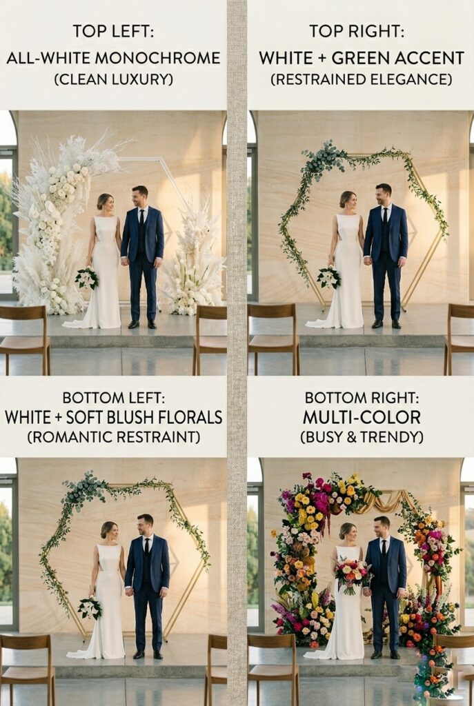
Simple backdrops that photograph well use color restraint—typically no more than two colors, often one primary color plus neutrals.
All-white or all-cream: Reads clean, modern, expensive. Requires perfect lighting to avoid looking flat.
Use textured materials (linen, wood, preserved greenery) to add visual interest without color variation.
Photograph beautifully because nothing competes with the couple.
White + one accent color: White backdrop + single-colored flowers, greenery, or element.
Examples: white + eucalyptus green, white + blush florals, white + gold arch. Restrained color palette reads expensive because it shows editorial control.
Monochrome (all-white with white everything): Ultimate minimalism.
White arch, white draping, white flowers, white venue. Reads luxury through commitment to constraint. Requires professional styling to avoid looking sterile.
Avoid: Multicolor backdrops, busy patterns, or color-block designs. These read trendy-dated. Simple, restrained color ages well.
Price range: Color strategy costs nothing—it’s a design decision. Restraint is free.
6. Lighting Simple Backdrops (Critical for Premium Look)

Simple backdrops require better lighting than busy ones because nothing hides mediocre light.
A single element under flat lighting looks flat. Under intentional lighting, it photographs expensively.
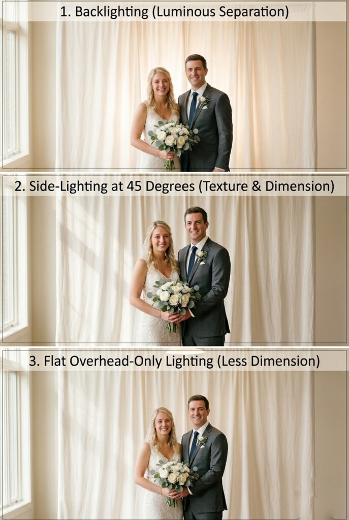
Side-lighting (45-degree angle): Creates shadow and dimension on simple elements.
Makes even basic materials (canvas, simple arch) photograph with texture and depth.
Requires additional light ($100–$300 rental) but transforms the look.
Backlighting: Creates separation and glow.
Simple element backlit against natural light reads dramatic and expensive.
Particularly effective for minimal installations and greenery.
Natural side-light (windows): Minimal backdrop photographed in soft window light costs $0 in additional lighting and photographs beautifully.
Requires timing and positioning but not equipment.
Avoid: Direct overhead lighting (flat and unflattering). Harsh spotlights (creates shadows).
No supplemental light (simple backdrops disappear).
The principle: simple backdrops require more thoughtful lighting than busy ones.
Price range: Lighting $0–$300. Critical for premium result with minimal backdrop.
7. Lighting Your Backdrop (So It Doesn’t Disappear in Photos)
A beautiful fabric backdrop can disappear in photographs if lighting is wrong.
Backdrop lighting affects how the backdrop reads in the final image and whether it separates from the couple or blends into shadow.
Backlighting (lights positioned behind/above the backdrop shining toward camera): Creates separation and dimension. Backdrop appears to glow.
Couple is lit from front. Professional, sophisticated look. Requires additional light setup ($200–$400 rental).
Side-lighting (lights positioned to the side of backdrop, 45-degree angle): Creates texture and shadow on fabric. Adds visual dimension.
Works well for textured backdrops. Makes simple fabrics appear more interesting.
Cost: $100–$300.
Front-lighting only (overhead venue lights): Flat, can make backdrop fade into background.
Couple may appear shadowed if lights are too far back.
Avoid for best results.
Natural light: For window or outdoor backdrops, use the existing light.
Supplement if needed with fill light ($100–$200).
The professional move: add one additional light ($100–$300 rental) positioned to either backlight or side-light your backdrop.
This single addition makes the difference between “nice backdrop” and “intentional design.”
Price range: Lighting adds $100–$400 to your budget. Worth the investment for professional photographic results.
8. The Psychology of Simple (Why Less Reads as Expensive)
Simple backdrops read as expensive because they demonstrate editorial control and confidence.
Busy backdrops read as trying too hard.
This is fundamental design principle.
Expensive-looking simplicity signals:
- Intentional design choices (we chose this deliberately)
- Budget control (we spent wisely on what matters)
- Confidence (we don’t need decoration to look good)
- Timelessness (won’t look dated next year)
Budget-looking busyness signals:
- Trying to fill space with decoration
- Lack of planning (random elements added)
- Insecurity (nothing is good enough alone)
- Trendy (will look dated quickly)
The principle: in design, restraint is read as luxury. Abundance is read as insecurity.
Price range: $0 cost. This is pure strategy.
Decision Filter
If your budget is under $300, design for absolute simplicity—one element styled perfectly.
Skip trying to add multiple elements.
One beautiful thing beats five mediocre things.
If your budget is $300–$700, invest in either excellent materials (premium linen or preserved greenery) or excellent lighting (professional side or backlighting).
One premium aspect elevates the entire look.
If you have a blank venue, use that emptiness as design. Empty walls, empty space, and simple positioning read more expensive than decorated spaces.
If your backdrop is in natural light (windows or outdoor), skip additional lighting investment.
Natural light is free and photographs beautifully with simple designs.
The Real Reason
Couples overthink simplicity because Instagram and Pinterest have trained them to believe more is better.
A wedding account with 500 followers might design a bedroom-sized arch with 1,000 flowers because that photographs well online and generates engagement.
A wedding with intentional design uses one element because that’s what the space needs.
Professional designers and photographers prefer simple backdrops because simplicity allows them to tell the story clearly.
The story is about the couple, not the decoration. Simple backdrops get out of the way.
They provide frame without competing.
They cost less and photograph better and age better. That’s not a compromise—that’s intentional design.
The couples whose weddings feel most expensive aren’t the ones who spent the most on decoration.
They’re the ones who designed with restraint and confidence.
Who understood that expensive aesthetic is about what you leave out, not what you put in.
Mistakes to Avoid
Mistake 1: Designing “simple” by removing decoration but not replacing it with intentional positioning and lighting, leaving your backdrop looking bare and unfinished rather than elegantly minimal. You take away flowers but don’t reposition the structure or add lighting.
Now it looks like you ran out of budget rather than designed minimally.
Simple requires intention. Barren requires neglect. Ensure every element—positioning, lighting, spacing—is deliberate.
Mistake 2: Choosing simple materials (canvas, basic arch, minimal greenery) then positioning them carelessly or with wrinkles and misalignment, which makes budget materials look cheap instead of minimal-luxury. The canvas isn’t draped intentionally.
The arch isn’t centered or positioned with purpose. Precision matters with simple design.
Every fold, every space, every angle matters because nothing else is distracting from poor execution.
Mistake 3: Designing a simple backdrop then adding “just a little more” decoration (a few flowers, some fabric, extra greenery) because it feels too bare, turning your intentional minimalism into scattered clutter. Trust the original simple design.
Once you commit to simplicity, commit fully. Adding one small element destroys the aesthetic. Simple means simple.
Mistake 4: Photographing a simple backdrop under poor lighting and accepting that “it’s minimal so it should look simple,” when actually professional minimal design requires better lighting than busy designs to photograph well. Simple + bad lighting = looks cheap. Simple + intentional lighting = looks expensive.
Don’t skip lighting investment with minimal backdrops.
FAQ
Does simple mean cheap?
No. Simple can be cheap if executed without intention (sparse backdrop with zero thought to positioning or lighting).
Simple executed intentionally (perfect proportions, strategic positioning, professional lighting) looks expensive.
The difference is execution, not materials.
What if I’m worried my simple backdrop will look too bare?
Trust the original design. Add one element (a branch, a single flower, one arch detail) and stop.
Test it photographically. Most couples adding “just a little more” destroy the minimal aesthetic.
Simple requires restraint even when it feels uncomfortable.
Can I do a simple backdrop on a budget?
Yes. Buy canvas ($30), paint it ($5), position it on a stand ($40), position the couple with intention, use natural light. Total: $75.
Photographs as expensive if execution is intentional. Budget isn’t the limiting factor—intention is.
Is minimal wedding design a trend or timeless?
Minimal design is timeless.
Trends are busy, colorful, pattern-heavy. Minimal—white, negative space, single elements—photographs the same way in every year.
Your photos will age better with minimal backdrops than with trendy decorated ones.
Simple backdrops that photograph as expensive are designed with restraint, positioned with intention, and lit professionally.
Nothing apologizes.
Every element serves purpose.
Empty space is design.
One beautiful thing beats five mediocre things.
Commit fully to simplicity and it reads as intentional luxury. Half-commit and it reads as budget-constrained.
Design as if simplicity was always your first choice.
For couples building complete wedding aesthetics around minimal design, see simple wedding decor ideas for how ceremony backdrops integrate into restrained full-wedding design.
If you’re designing elegant ceremony backdrops, elegant wedding decor ideas covers sophisticated ceremony strategies.
For specific venue types, indoor wedding decor ideas and outdoor wedding decor ideas offer minimal strategies tailored to your space.
For comprehensive ceremony design principles beyond backdrops, wedding ceremony backdrop provides full ceremony framing guidance.